• PRODUCT + COMPANY VALUES
Voodies is your one-stop shop for food content, reviews, and influencer insights. Think DoorDash + TikTok + Yelp all on one platform. What sets Voodies apart is that it serves both users and restaurants. Restaurants are able to platform themselves and establish their unique brand to connect with users. Let's remove all the additional noise from conventional social media apps & make finding food as easy as possible.
• MY ROLE
Leading the redesign of the Home + Discover Page
When I joined this startup, I was given the opportunity to choose which features to lead. The app had just launched and I had a 3 month timeline to flesh out my features for V2! For me, the Home and Discover pages were the most critical parts of the product, and as a user myself, I knew the priority needed to begin there.

THE PROBLEM STATEMENT:
How might I redesign these core features to enhance food discovery and elevate the overall user experience?
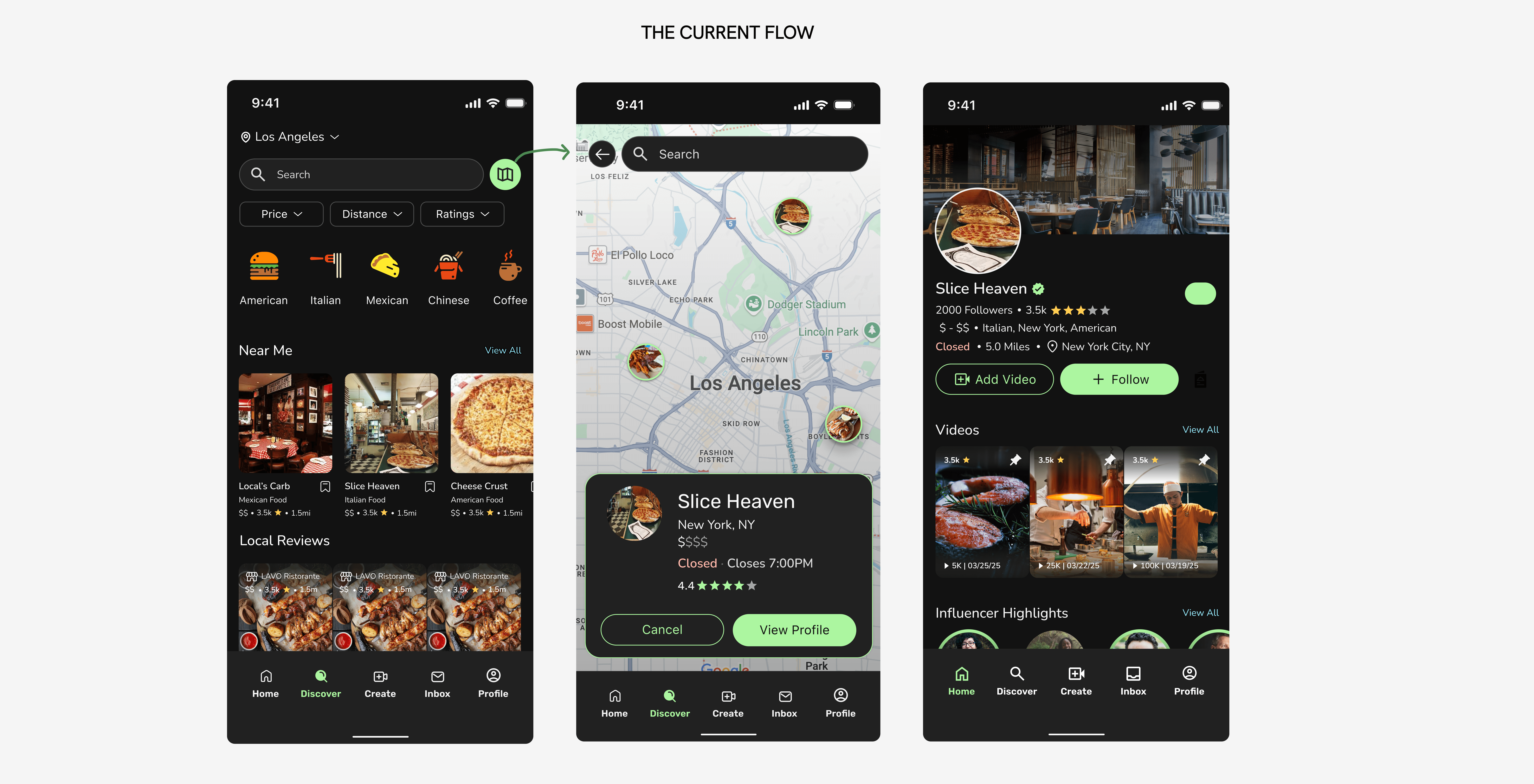
[01] USER RESEARCH & INITIAL ITERATIONS
• THE PROCESS
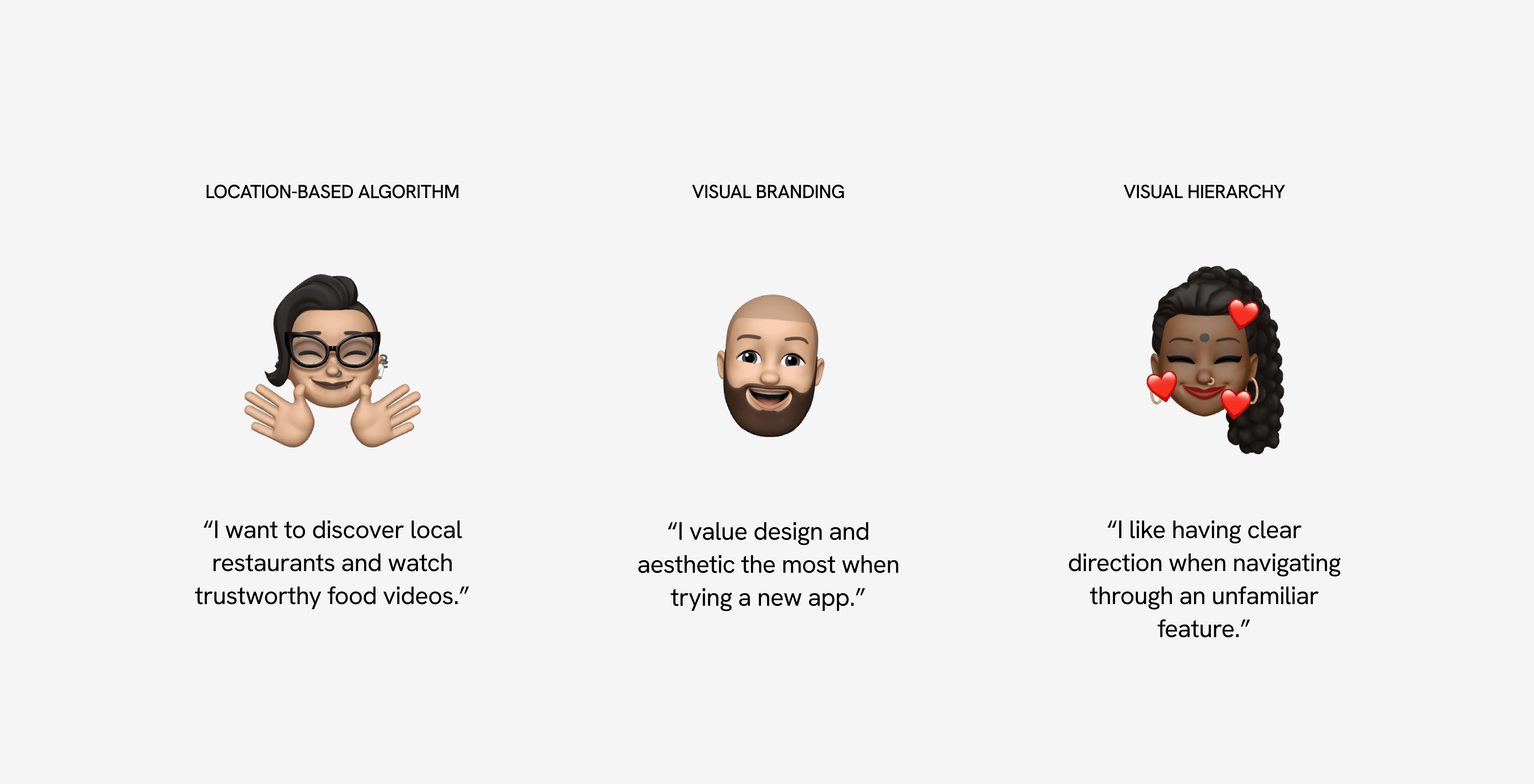
Location-based algorithm, visual branding, & hierarchy
Decision fatigue when it comes to finding the perfect place to eat is common. In Voodies’ current design, there’s no clear prioritization or hierarchy of sub-features across the pages, making navigation and decision-making more challenging for users. Here's the plan:
• INITIAL ITERATIONS
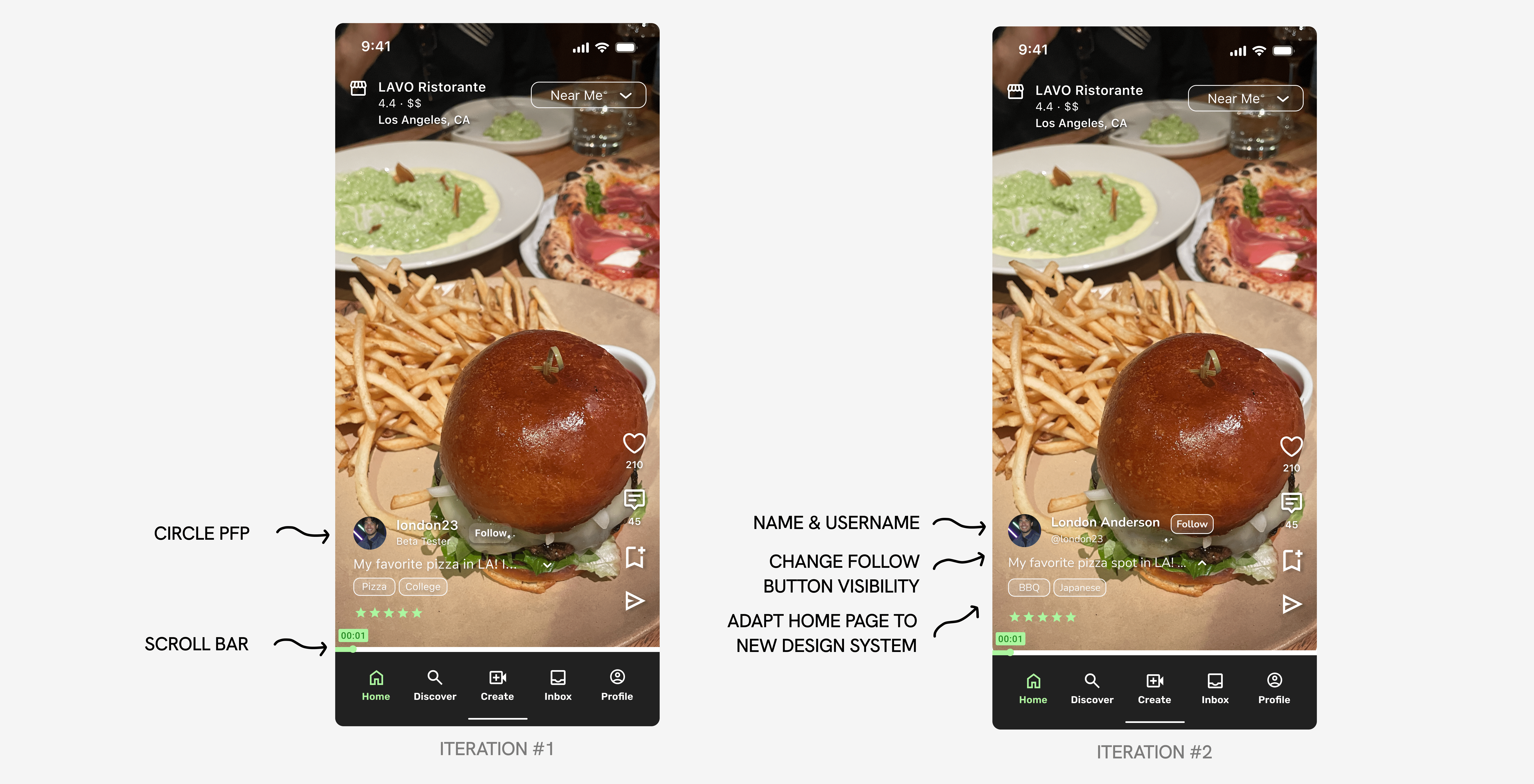
Adding features to the Home Page
How do I hook a user within the first 3 seconds? I drew inspiration from TikTok, Instagram Reels, and other video-first platforms, adapting their proven, engaging design patterns to fit Voodies’ unique brand and goals.
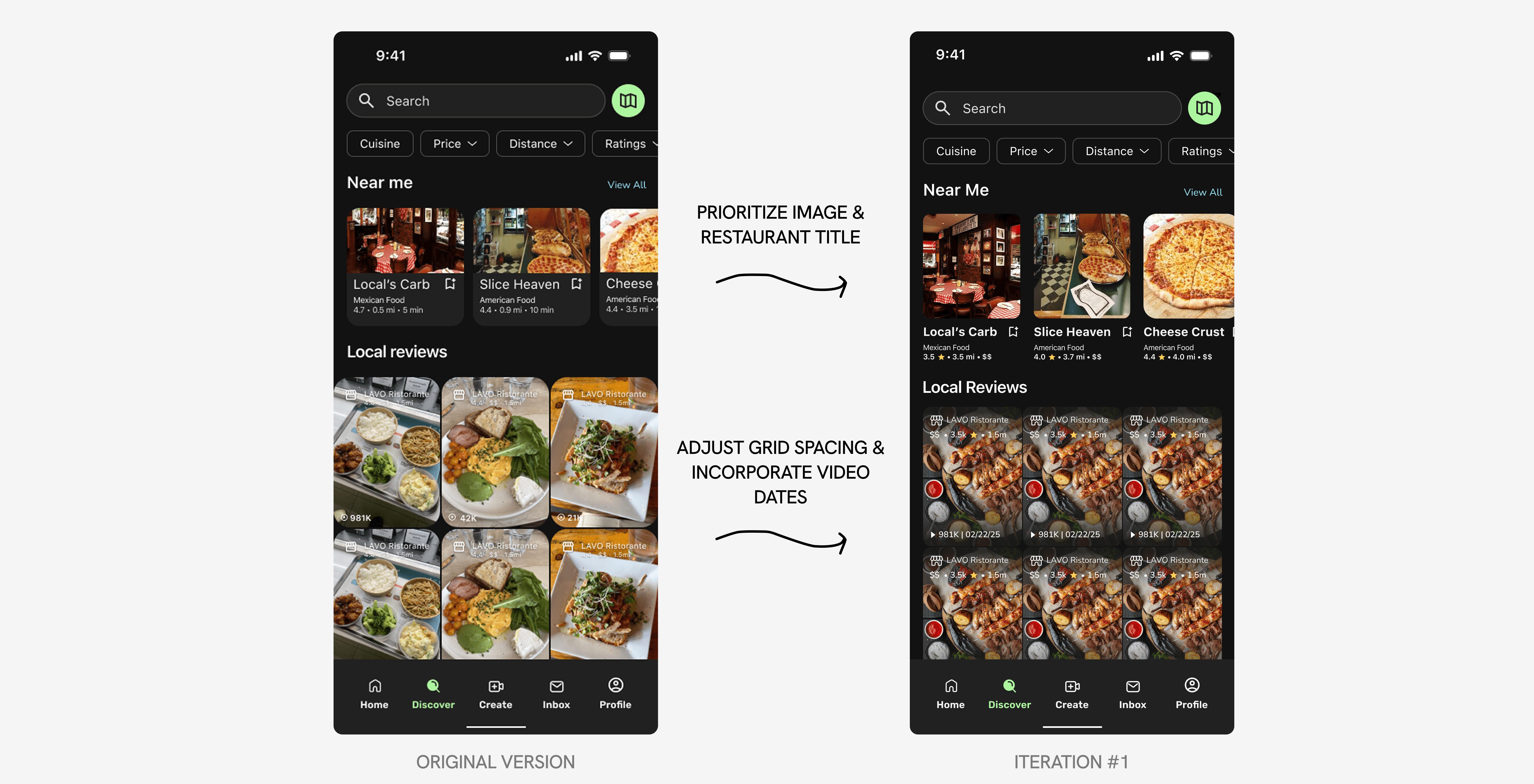
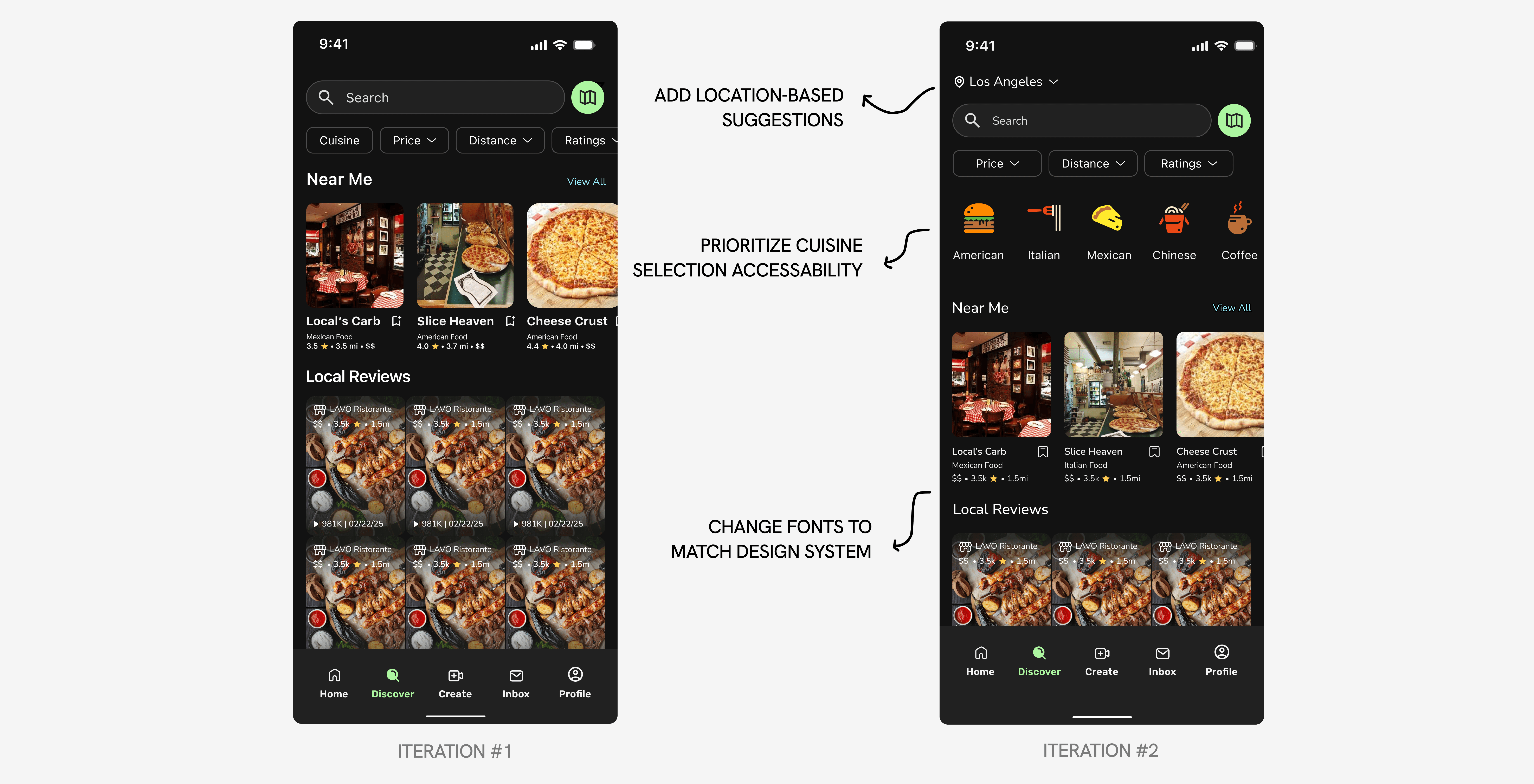
Refining the visual interface of the Discover Page
I focused on enhancing the visual interface, refining the hierarchy, and adding new features to create a more cohesive and polished experience aligned with the design system and consistent spacing.
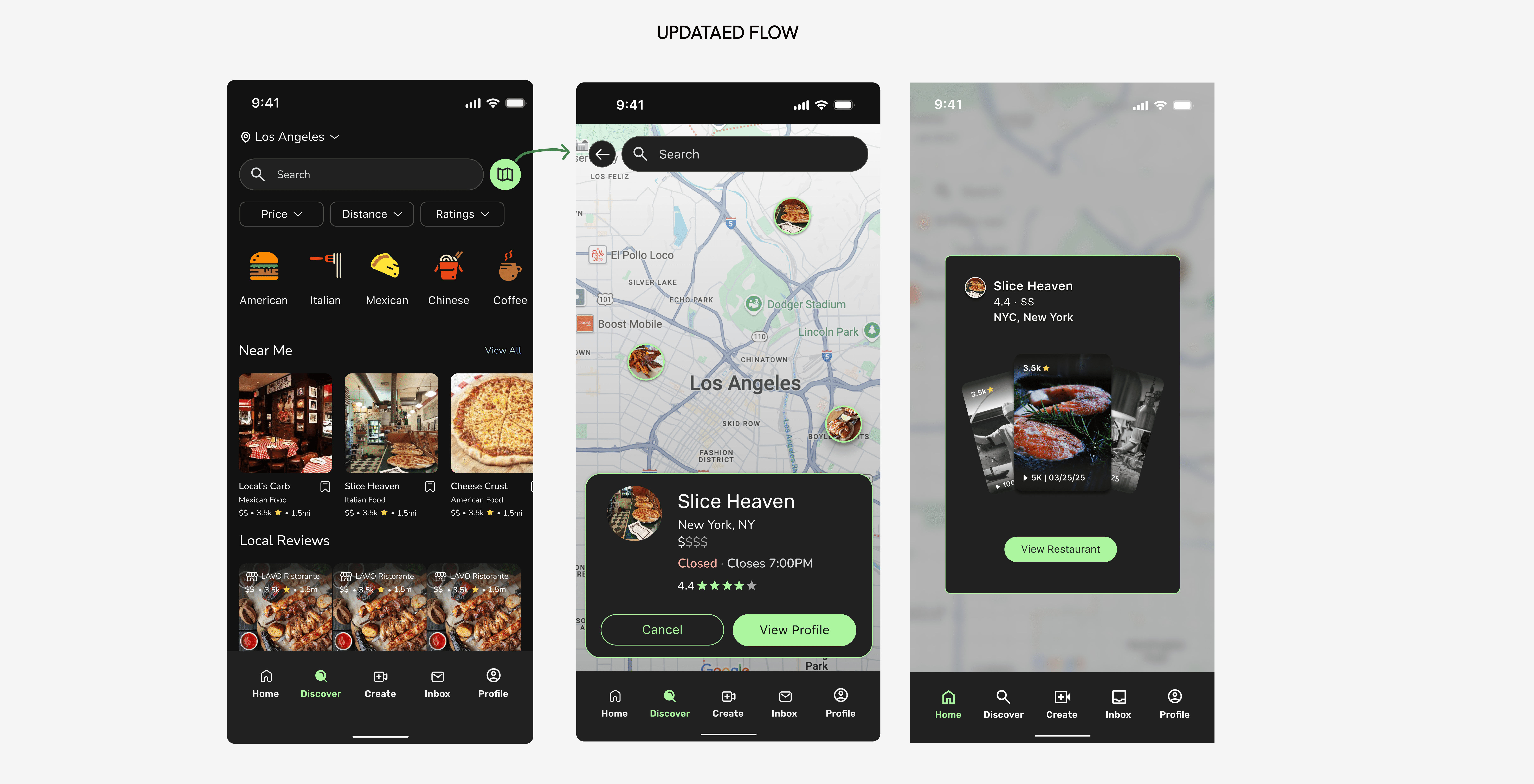
[02] problem: integrating user-created videos into discovery
• challenge #1
Too much friction
Currently, finding user videos while on the Discover Page takes multiple steps. This causes friction between the user and the intended action behind discover. The goal is to make videos more apparent as users don't want to read about food, they want to see it.
• the solution
Presenting videos to users first!
Here, users are presented with a sneak peek of videos first. They are able to swipe through or click on the featured video to decide if they want to continue exploring the restaurant.
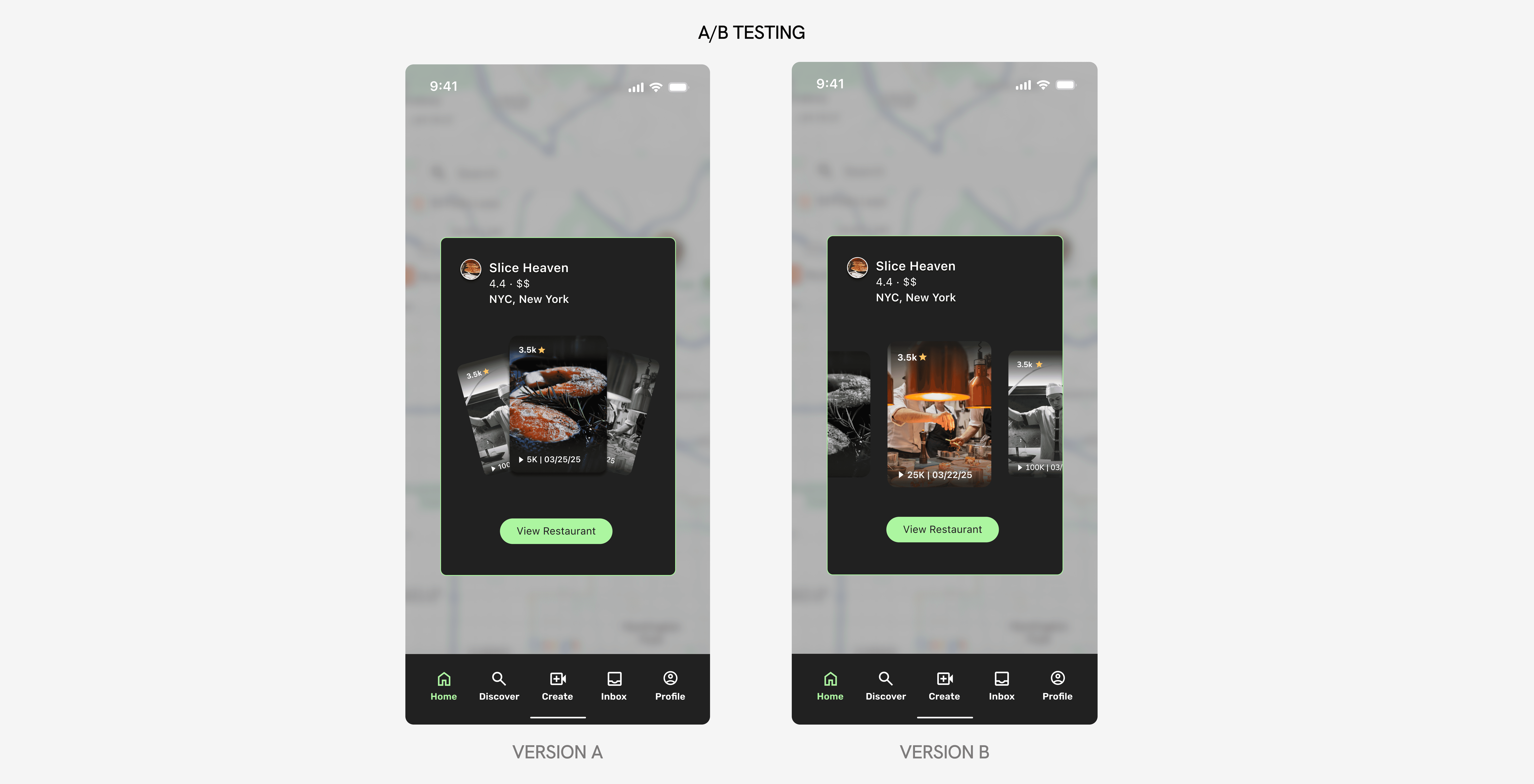
[03] user testing
Designing an intuitive swiping mechanism & indicator
I handed off my iterations to a UX Researcher to conduct A/B testing. With 25+ participant results, I was able to verify that Version B was the preferred option. With this updated design, users can quickly explore food through visual content instead of text-heavy information. My goal was to minimize steps, reduce information overload, and lower cognitive load right from the start.
• SOLUTION
Revamping the way people find food, with one video at a time.
Adapting current food & content creation platforms to Voodies' unique brand.
• THE CURRENT IMPACT
800+ downloads in the first month
624+ active users
670+ onboarded restaurants
• WRAP-UP
Takeaways
Voodies was my first ever startup experience! It was amazing to be surrounded by passionate, hard-working students and recent graduates who all want to change the food scene. Although my time here at Voodies has come to an end, I can proudly say that I contributed to building a product that brings people together through food, grew both my design and collaboration skills, and gained invaluable insight into the fast-paced world of startups.