ROLE
TIMELINE
MY TEAM
TOOLBOX
• PRODUCT CONSULTATION
Bruinwalk is UCLA's very-own trusted platform for students to leave anonymous reviews on professors, courses, & apartments! Built by students under UCLA Student Media, Bruinwalk brings a personalized experience to Bruins during the stressful time of enrollment.
THE PROBLEM STATEMENT:
How might we reimagine Bruinwalk as a centralized platform that supports students in real time throughout the enrollment period?
• RESEARCH
Enrollment is one of UCLA's biggest "cons"
Getting classes @ UCLA is known to be stressful, ineffective, and frustrating. While Bruinwalk help students pick the right classes, it does not help the student during the process. How fast will my class fill up? How can I track the status of a class? With Bruinwalk's popularity amongst students, finding better ways to support our peers was a priority.
What other tools are students using?

Hotseat.io: shows enrollment distribution over time, but only tracks real-time drops rather than enrollment.

Coursicle: sends notifs when a class has open seats, but students are limited to tracking 2 courses at a time.

ClassRabbit: monitors class availability & sends notifs, but does not show real-time progress.
• FEATURE OVERVIEW
To aid students in real-time, there are 3 main features we focused on:
After conducting user interviews, we found that students were most apprehensive when when it comes to tracking classes and waiting for seats to open up. Here are the features we came up with help students feel more at ease:
Real-Time Enrollment Graphs
Push Notifications
Class Status Indicators
• REAL-TIME ENROLLMENT GRAPHS ITERATIONS
Finding the most optimal way to show data
Building on the original enrollment progress designs, we explored ways that we could adapt them dynamically to live enrollment updates. Here are the two main iterations we tested on:
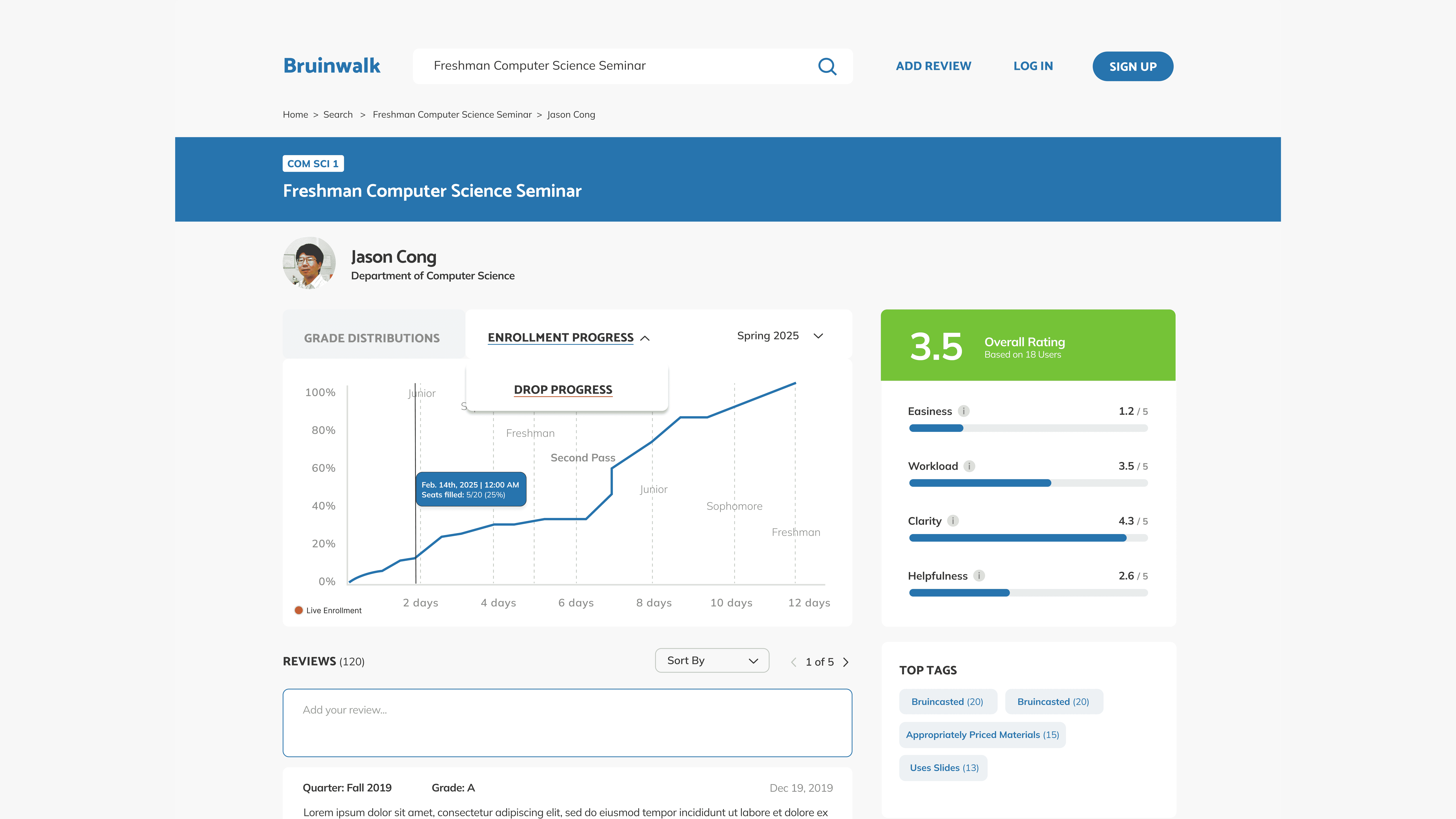
ITERATION #1: DISPLAY ENROLLMENT & DROP PROGRESSES
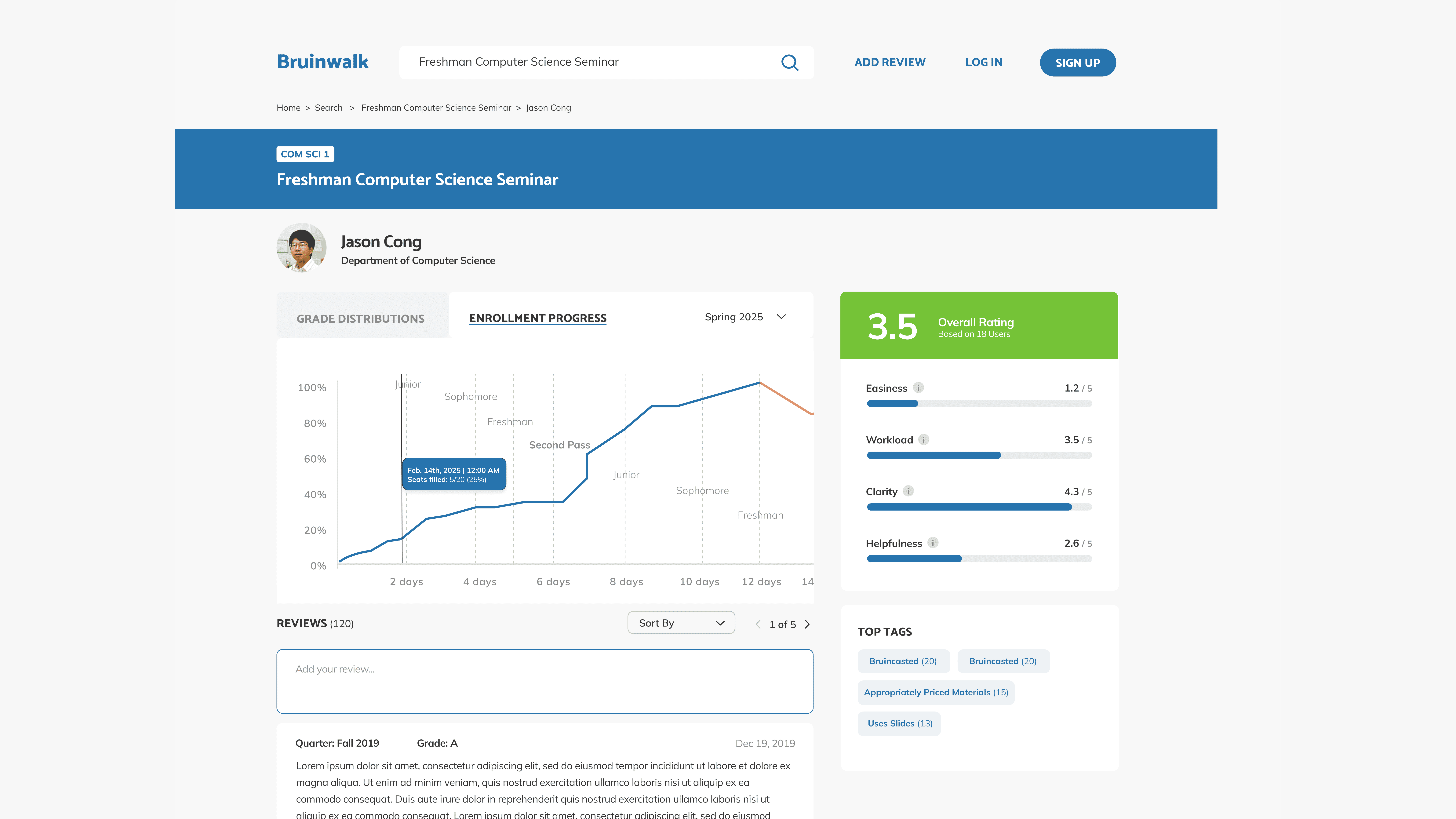
ITERATION #2: SCROLLABLE GRAPH
• User testing
Missing a crucial flow & violating accessibility
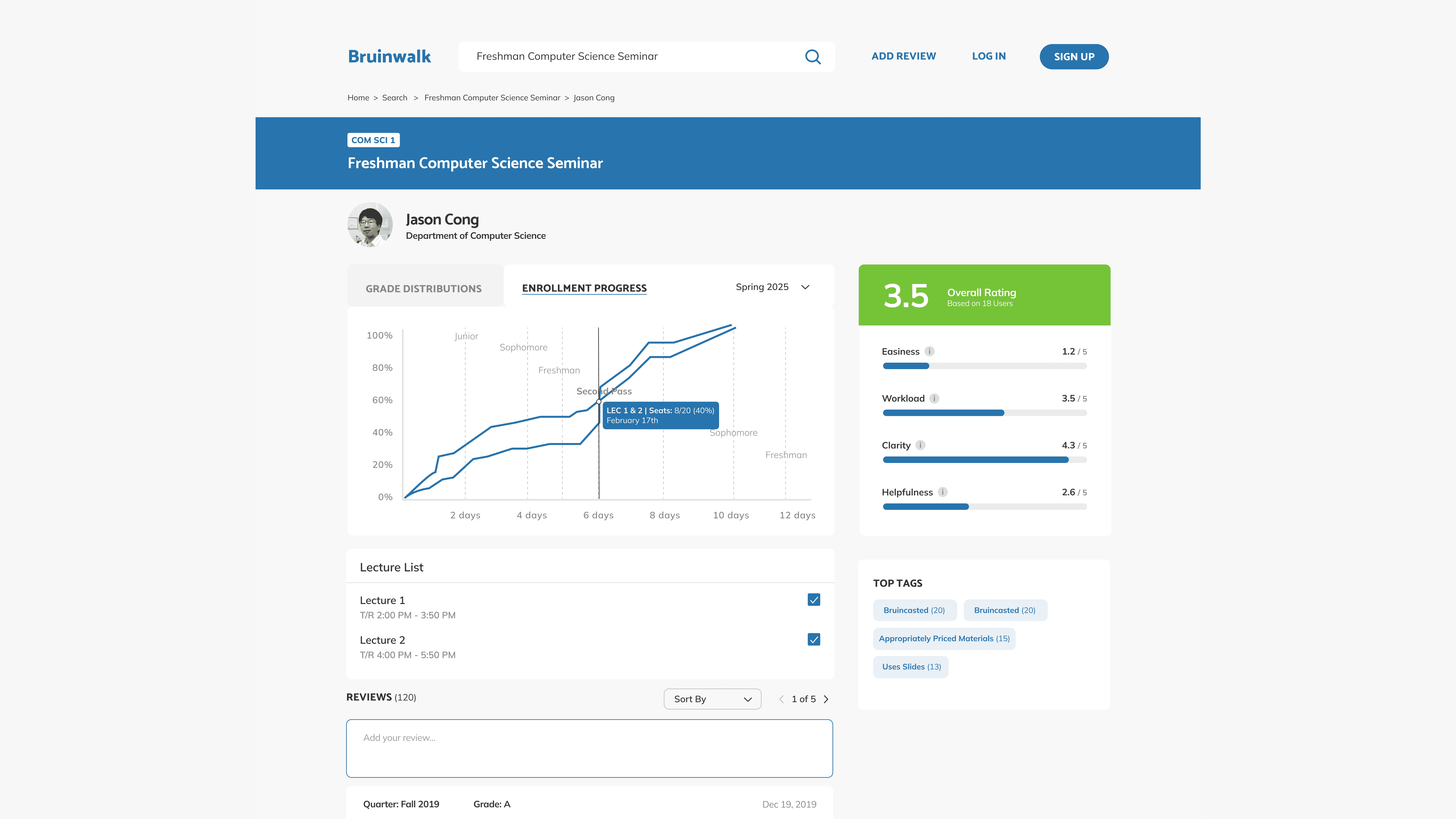
After user testing, we found two key insights: we found that we had not accounted for professors having multiple lecture times.
Not accounting for professors who have multiple lecture times.
Scrollable graph violates the WCAG 2.2 Success Criterion 1.4.10 Reflow.
Applying feedback: a selectable lecture list!
I designed a selectable lecture list that displays all the sections a professor teaches for a given course. Users can choose a specific lecture to view its live enrollment progress and even compare two sections side by side for better decision-making.
*at this point, our manager requested that we switch to UCLA’s official shade of blue & so that I did :)
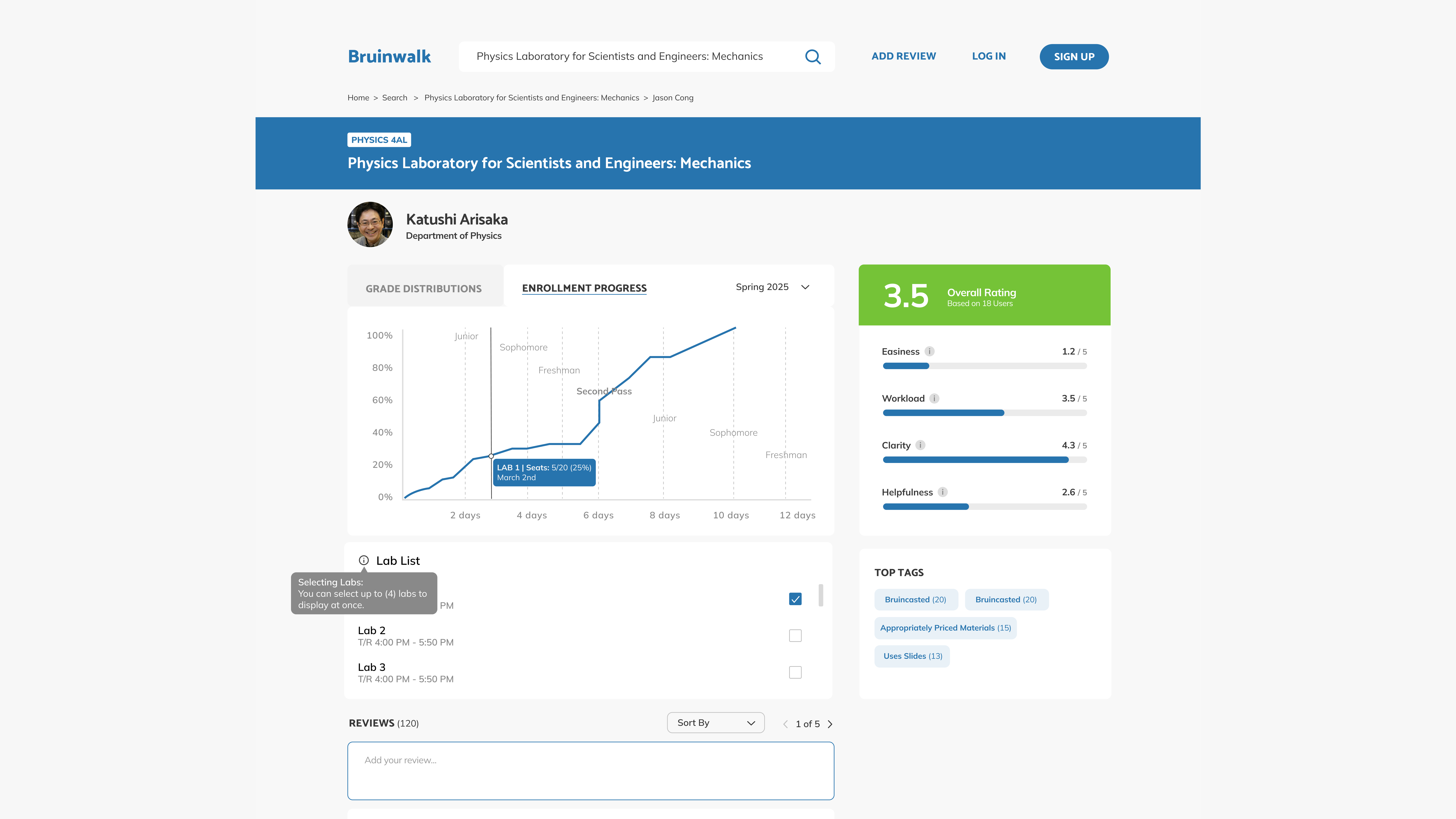
Adapting the design to labs
With this updated design, I was also able to support the integration of lab enrollments. Since UCLA labs can have over 10 sections, I implemented a cap that allows students to view up to 4 lab sections at a time. In most cases, students typically track 4–5 alternative options that fit their schedule. By setting this limit, we reduce visual clutter and ensure that students can compare their options with ease.
Why did we remove drop progress graphs?
Unlike enrollment period, drops can happen at any unpredictable time! We decided that this acted as "less actionable" information as students are unlikely to track drop trends. Instead, we prioritized fleshing out our notifications feature which would inform students on when a class is open. This approach still monitors course drops, but it becomes actionable.

• SOLUTION
Changing the enrollment experience forever.
Take a look at our final designs to see how we turned a universal student challenge into an effective solution :D
• impact
92% success rate for feature-enabled tasks
94.2 usability score on Maze
27% increase in session depth. Users went from visiting 1.8 to 2.3 pageviews per visit
Reduced end-to-end enrollment time by 43%.
• WRAP-UP
Takeaways & impact
Bruinwalk continues to serve 53,000+ students and attract 30,000+ monthly visitors. Coming into UCLA, Bruinwalk was my favorite tool and it makes me feel incredibly privileged to have had the opportunity to be behind the scenes and advocate for students. With this new & improved Bruinwalk, I hope to have changed the way enrollment feels, even if it's just one person.
