Leading the redesign of the Home + Discover Page

• The Current Impact
800+
downloads in the first month
•
670+ onboarded restaurants
•
624+
active users & increasing
My Task ☺︎
Revamping the way people find food, with one video at a time.
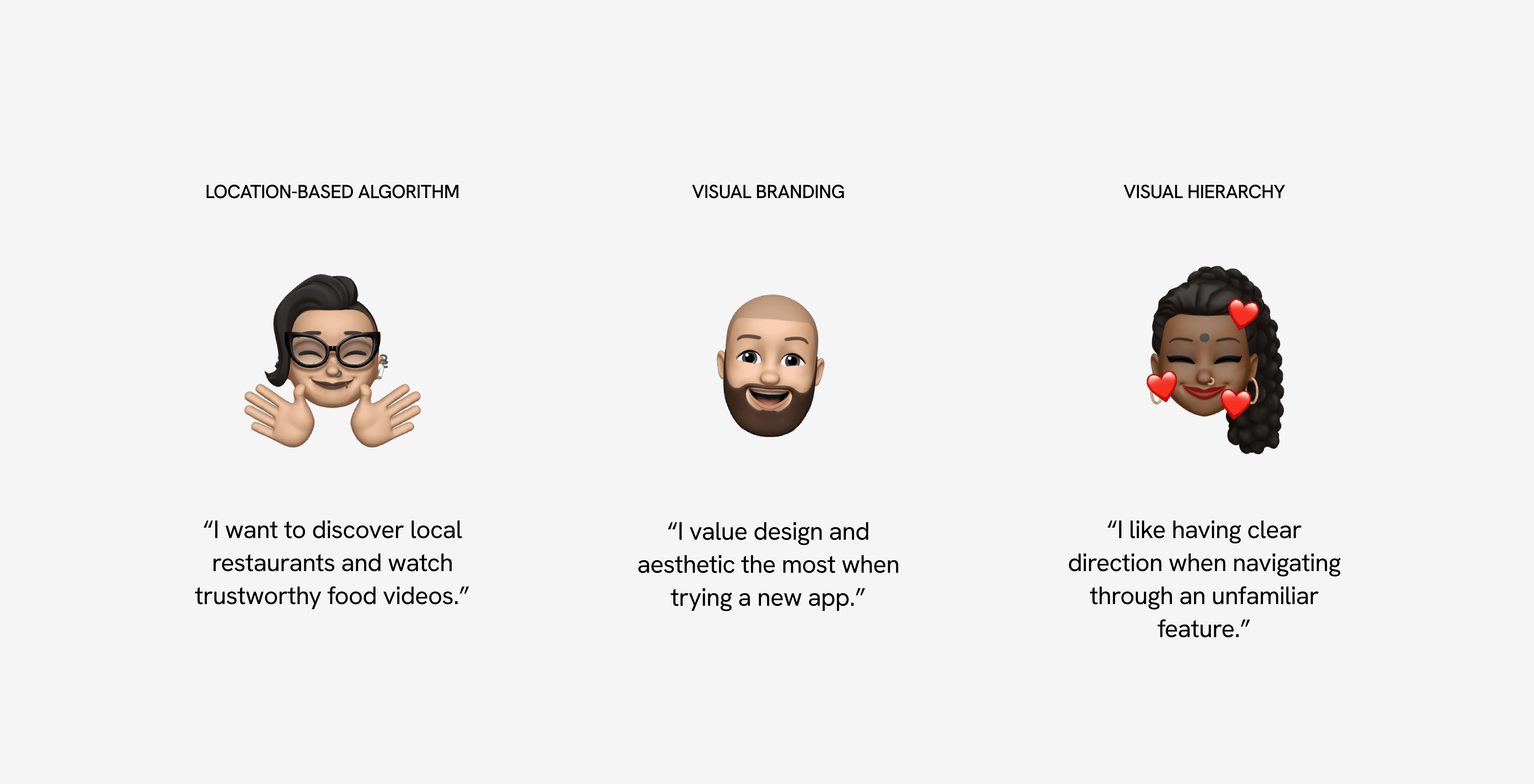
Location-based algorithm, visual branding, & hierarchy
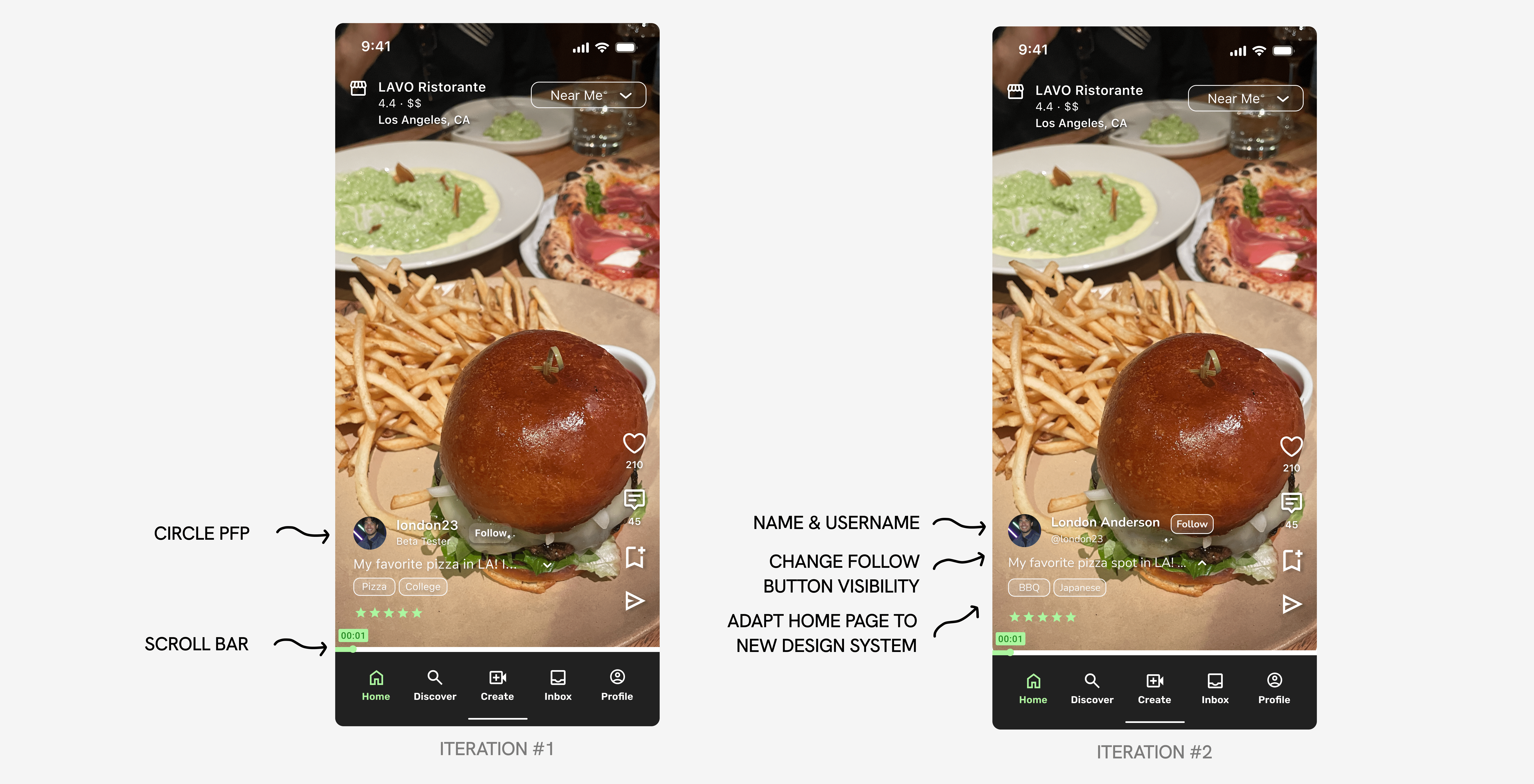
Adding features to the Home Page
How do I hook a user within the first 3 seconds? I drew inspiration from TikTok, Instagram Reels, and other video-first platforms, adapting their proven, engaging design patterns to fit Voodies’ unique brand and goals.
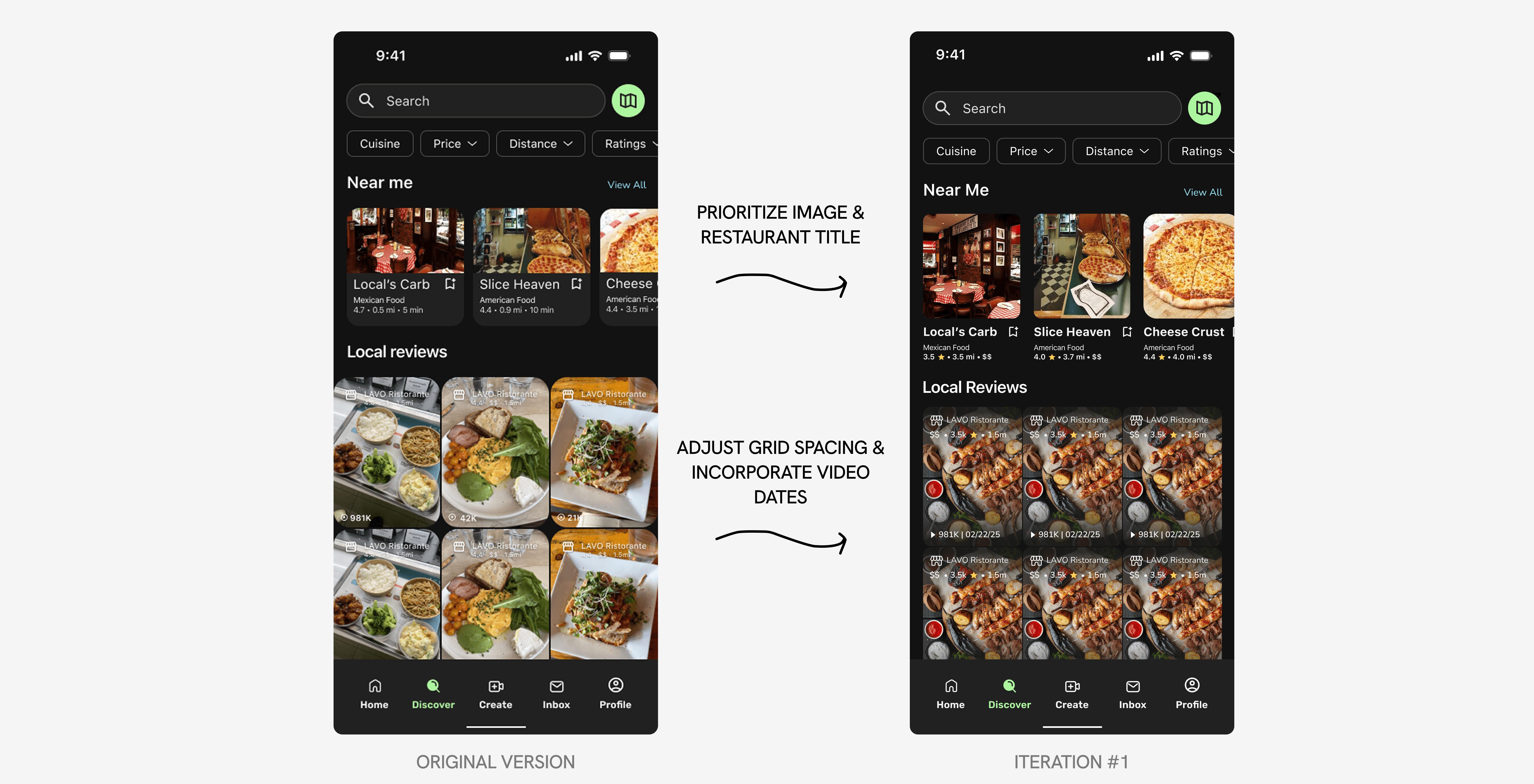
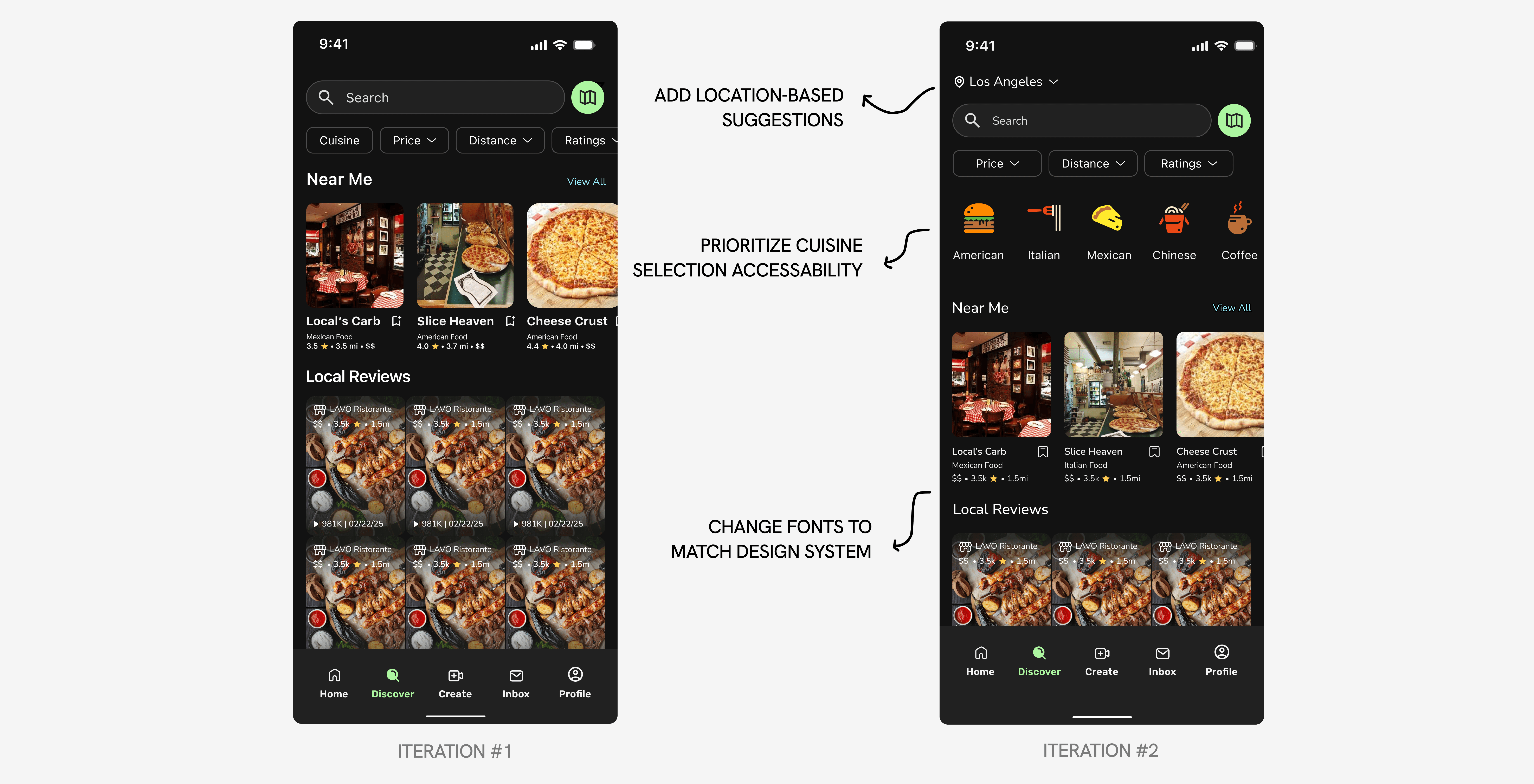
Refining the visual interface of the Discover Page
I focused on enhancing the visual interface, refining the hierarchy, and adding new features to create a more cohesive and polished experience aligned with the design system and consistent spacing.
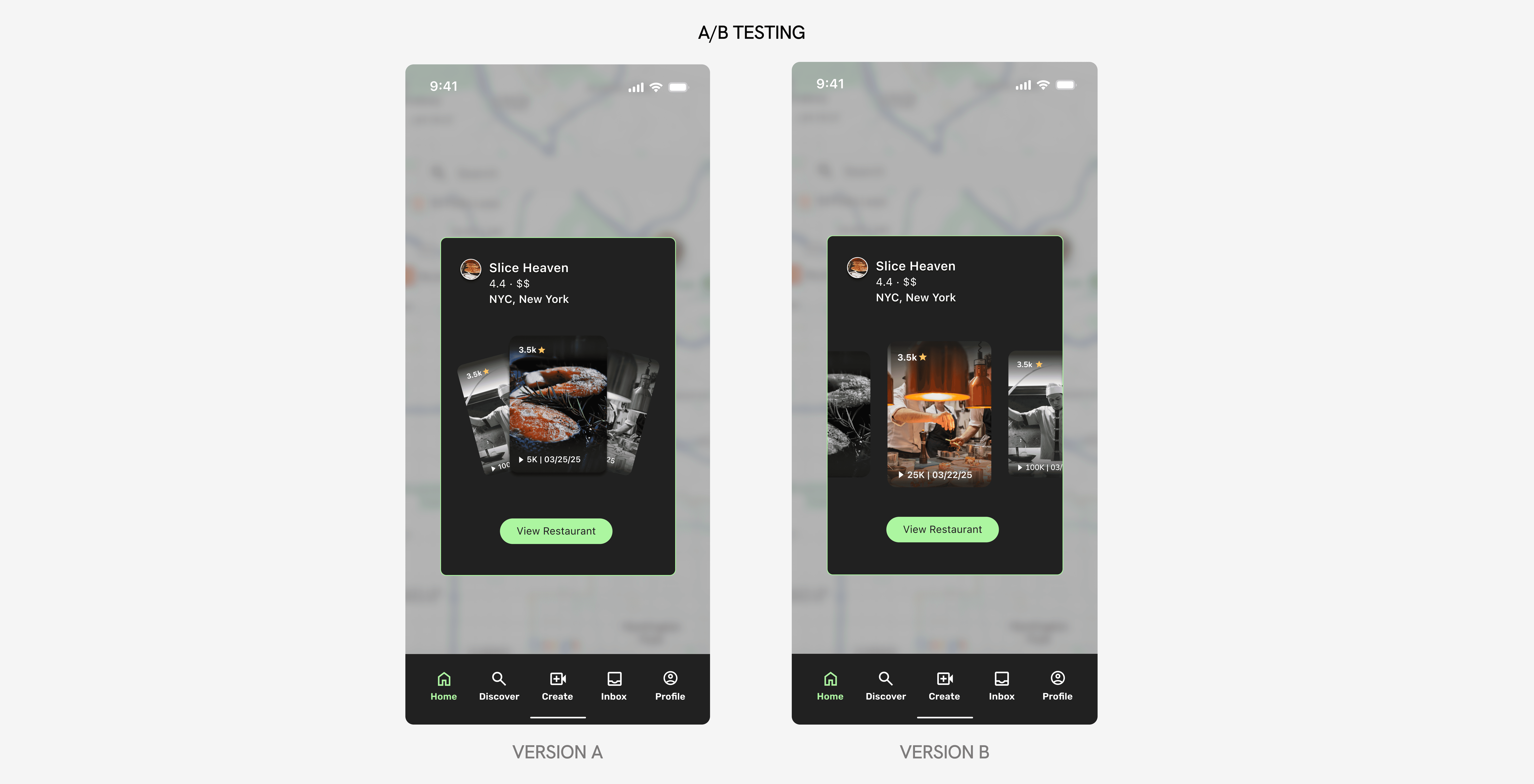
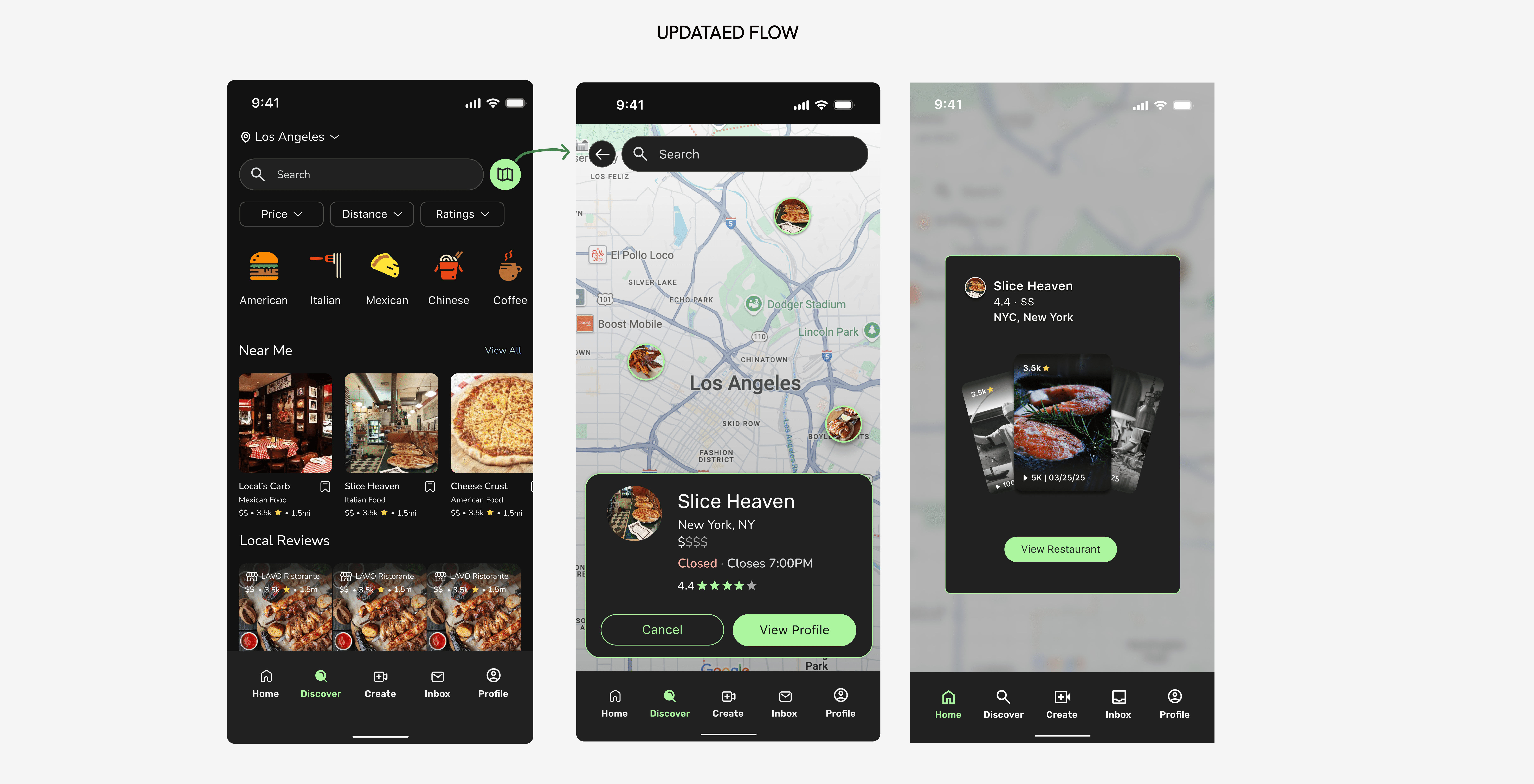
• 1st Challenge
Too much friction
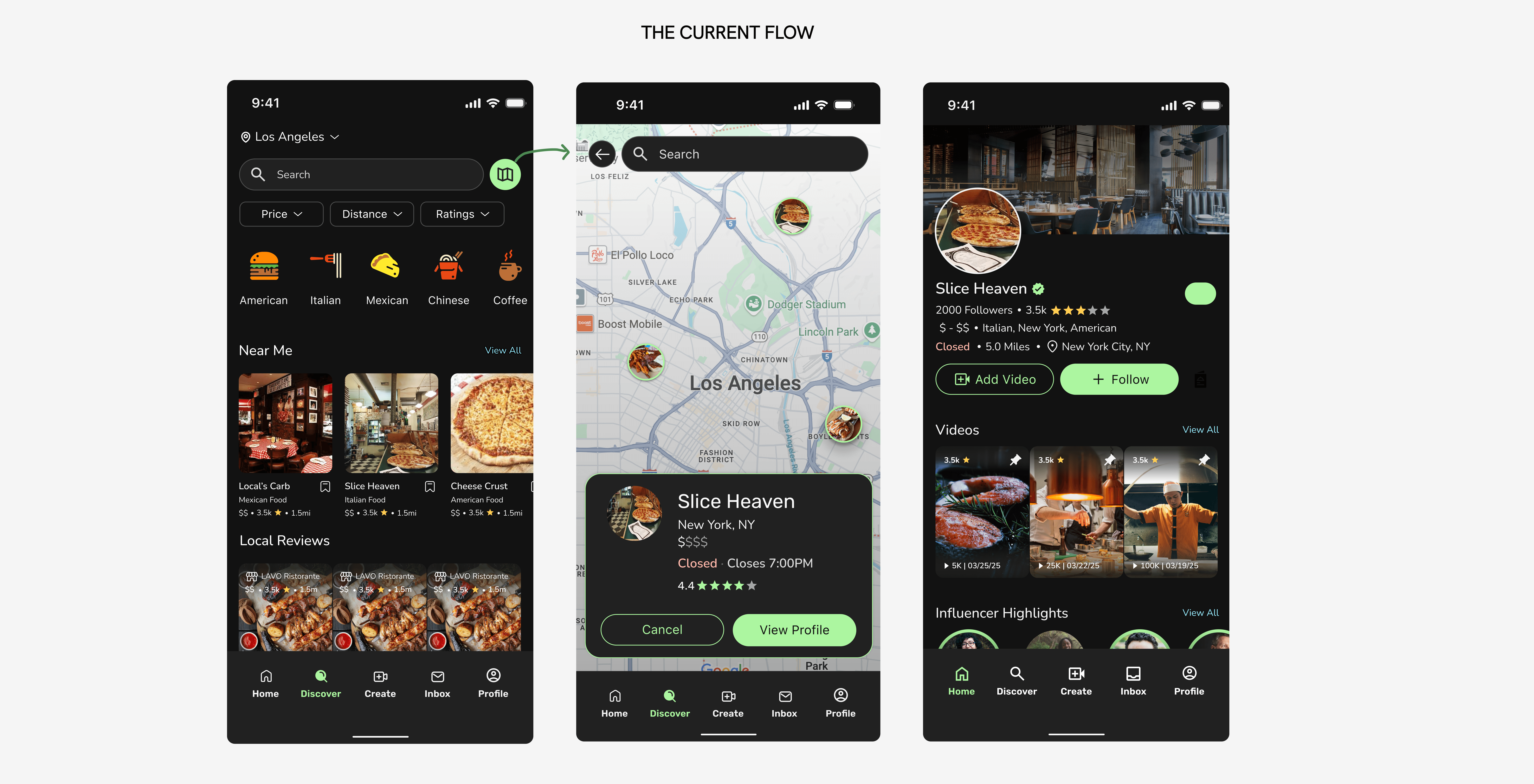
Presenting videos to users first!
Here, users are presented with a sneak peek of videos first. They are able to swipe through or click on the featured video to decide if they want to continue exploring the restaurant.
• 2nd Challenge
Designing an intuitive swiping mechanism & indicator
I handed off my iterations to a UX Researcher to conduct A/B testing. With 25+ participant results, I was able to verify that Version B was the preferred option. With this updated design, users can quickly explore food through visual content instead of text-heavy information. My goal was to minimize steps, reduce information overload, and lower cognitive load right from the start.